

Improve retail performance : method All Purpose Cleaner
The All Purpose Challenge
After 4 years on shelf, the method “All Purpose Cleaner” was declining in sales at retail. The bottle structure, whilst iconic in its own right, had limited real estate for labeling which limited the ability to tell the full band story especially when coupled with the need for dual/multiple languages on pack. I’m not a fan of to much marketing copy cluttering up the front of packs, (studies have shown that consumers really only read 3 lines of copy before making their selection at shelf), and a cluttered label always distracts from any sculptural aspects for the bottle. This might not be an issue with most conventional spray bottle brands, but it would be with method.
The Clean Solution
Moving to a 4 four sided 100% PCR PET bottle allowed method to keep its iconic silhouette and also dramatically increase the label area. The brand moved to complete panels of multi language romance copy but only placed on the side panels. The front label, and strikingly, no back label, maximizing the prismatic beauty of the bottle. This seemed like a great compromise with the view from the front of the bottle ( the “on shelf” view) remaining clean and transparent due to the lack of the back panel.
The improved presentation of the brand drove increased velocity at retail and became a major point of entry and leading recruiting SKU for the brand.

Previous design with limited label real estate
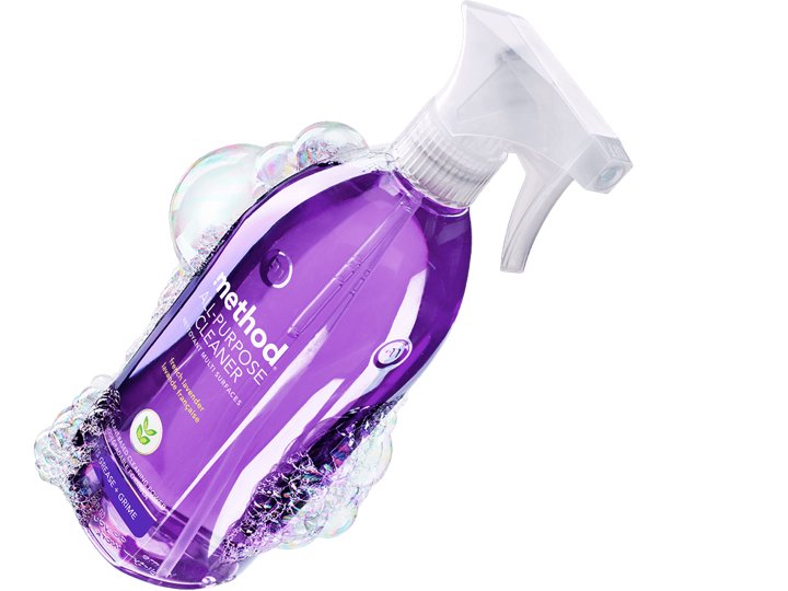
beauty shot! (credit method)

New APC bottle, maximizing label area (no rear label) (credit method)